If you want to learn How to paint Cityscapes than watch my first Demonstration and subscribe my YouTube channel.
I am in the process of making new videos and will keep uploading for you.

Art Canvas Factory is a leading manufacturer of new age artist canvases, as well as the originator of their patented canvas stretcher design!
Why must your art talent suffer because of low grade and quality canvas mounts?
www.artcanvasfactory.com
Showing posts with label watercolor. Show all posts
Showing posts with label watercolor. Show all posts
Thursday, April 2, 2020

Monday, January 13, 2020
Learn How To Paint Watercolors Fast - Use Only 1 Color
Learning to paint fast is difficult. Some say it feels impossible...
But it doesn't have to be so hard...
Like all skills, whether in Arts, Crafts or any profession the trick is to remove complication. Watch any expert work and you will be amazed how quickly they make the impossible seem easy...
Think of a Blacksmith making horseshoes on his anvil...
He knows how to make the fire hot enough to make the metal soft without melting
He knows that every strike of his hammer will shape and mould the steel
He knows just how to trim the hoof to make the shoe fit
He never doubts his ability to give the horse he makes the shoes for exactly what is needed for comfort and wear
It is an honor to see a craftsman at work. It is a privilege to witness the accumulation of many years hands-on knowledge.
Learning to be an artist takes time. Learning to paint professionally can take many years...
The fastest way to learn to paint watercolors is to take it in small stages... starting simple and building painting skills with small steps.
The first step is to paint watercolor using 1 color... it can't get any simpler...

You learn how to thin watercolor paint with your brush
You learn how much water you need to get a certain tone of color
You learn how to use water to carry color pigment across your watercolor paper
You learn what can go wrong when you touch your wet paper with a brush full of color
You learn to expect surprises
You learn to want to encourage surprises by experimenting with new techniques
And, most importantly, you get the opportunity to learn to draw with your watercolor brush... You learn how to make your brush become your best friend.
When you use only 1 color to learn how to paint watercolors it is easy to concentrate...
You can quickly learn how to get color tone right
You soon learn that color will flood and spread across wet paper
You know that if an earlier wash is fully dry it will be spoiled if you let your next brush mark touch
You find yourself doing amazing things with watercolors fast because you don't have to worry about which colors you need to mix that favorite green, or the orange you saw in last night's sunset.
Learning how to paint watercolors using only 1 color helps you learn fast because you don't even need to worry about making mistakes...
It is quick and easy to do it again because you have kept it simple
You have perfected the basics of learning watercolor painting
Perfect the basics of watercolor painting and nothing can stop you from mastering the next stage... Learning How To Mix Colors.
Michael Dale is the author of 1- Color Is Best (the quick and easy way to learn to paint watercolor) and 3- Colors Are All You Need (mix any color you want fast using only 3 colors). Contact [http://www.Paint-And-Draw.com] to find out more.
Article Source: https://EzineArticles.com/expert/Michael_Dale/145082
Monday, December 23, 2019
Monday, November 11, 2019
Monday, November 4, 2019
Monday, September 30, 2019
A Rose Grows in Rehab - Using Watercolors as a Healing Tool
As a visual artist, I am always discovering ways that art can be used to enhance the lives of others. One of those ways is to aid in the healing of those mentally or physically ill.
My Tools
This year I started traveling with a small watercolor kit. The size of the kit is a "4x6" block. I also use the Strathmore blank post cards. The imperial watercolor paper works well for this kind of thing.
I went to a physical rehabilitation facility on a Monday evening equipped with these tools. The woman and friend I was visiting was in her seventies and recovering from surgery on her neck.
After we chatted for a while, I asked her if she would like a picture for her room. Her answer was a resounding YES. I should note that she already had an assortment of my prints in her home. Consequently, it was not a hard to convince her to allow me to paint.
My wife entertained her with a modern day version of a familiar bible story while I worked. I drew the rose first and completed it with the watercolors in her favorite color-Yellow. This enabled me to complete the work quickly.
When the rose was completed, this woman with hands still fighting for mobility reached out to touch the painting. Her face glowed as she looked with awe at her picture. I signed it and wrote a note of encouragement before I hung it where she could see it at all times.
Her roommate then begged me to paint a picture for her also. I did.

I am convinced, as many artists reading this will agree that artists must constantly work on their craft. Therefore, if you work on your art while visiting someone it can be a win-win situation.
Please know that I AM NOT SUGGESTING THAT YOU GIVE AWAY YOUR MASTERPIECES. However, believe that the person who is ill will see what ever you can contribute as a masterpiece. You will also be donating your time and healing concern. Isn't that what art is all about?
Lets all keep working to bring healing art to the world.
Ray Horner is a fine artist, inspirational speaker and art instructor
http://www.hornerartworkshop.com
Article Source: https://EzineArticles.com/expert/Raymond_Horner/63539
Monday, September 23, 2019
Isn't Watercolors Hard?
It seems that each time I show my watercolor paintings at shows or events, someone will say to me, "Watercolors are hard."
I smile and ask, "Why do you say that?"

THE MYTH : There is a myth circulating that painting with watercolors is difficult. Why? Is it because watercolors can become uncontrollable and people tend to want to be in control? Is it the effects of the medium? Or, what, I do not know? This myth continues to fascinate me and who knows, maybe, someday, I will have an answer.
THE TRUTH : Watercolor painting is not unlike other disciplines. Whenever a person undertakes a new experience there seems to be a "training period" where learning and skills are acquired. At this stage in the game, most people seek out an experienced person who they admire and who possesses that which they would like to emulate. This is true with any endeavor, so why not watercolor painting?
What makes watercolors different? What makes them so different is that you never know what will happen. Are you a person who likes surprises? Watercolors will surprise you each and every time you paint. A colleague of mine has a favorite saying which is "Let's see what will show up when I paint today." It is absolutely fascinating what water and pigment will do. To repeat an effect is challenging or not possible. Each time it is unique.
There are established techniques for watercolors as with any other art medium. These skills are helpful yet not necessary to express your self in watercolors. Many artists, and I believe everyone is an artist at heart, freely paint and allow what appears to tell them where to go or what to do next. Sometimes "what is" can be pleasing by itself. There are NO RULES! It is my belief that artistic expression lies in all of us and requires only a sense of trust and the freedom to allow the flowing for magic to happen.
A favorite way I freely express myself with watercolors is to paint Mandalas. Basically, painting within a circle, a mandala, creates a meditative state whereby a person freely paints anything they wish. In my experience sharing mandala painting with students, we have witnessed an array of all beautiful, unique mandala creations.
The one thing that sets watercolors apart from other painting media is that it is a spontaneous method. First impressions are vital. You cannot go back and change it, or rarely. This might be a little intimidating to people, yet it can be very refreshing, too. I have found that my favorite paintings have had this light, first impression touch which magically flows, no effort. It is just there.
Not every piece is a masterpiece. Of course, there is always more paper. I must admit that I have turned less successful paintings into new paintings with collage. Watercolor paintings are full of happy accidents. You will never know what to expect and this is the nature of watercolors and most likely fuels the myth.
ARTISTIC EXPRESSION: The fun of creating is what it we are all about, right? It is our connection with our soul. I feel as if I learn everyday when I sit down to create a watercolor painting. Watercolors change, I change, the subjects change. People tend to avoid change because it requires letting go of external layers of beliefs. Maybe the myth is true that watercolors are difficult, what do you think?
Joanne Osband is an accomplished artist and registered art therapist who is a kind and masterful guide for assisting others to discover the gifts that live within us.
http://www.ColoringOutOfTheLines.com
Article Source: https://EzineArticles.com/expert/Joanne_Osband/102601
Article Source: http://EzineArticles.com/604367
Sunday, September 22, 2019
Acrylic Painting Techniques
The acrylic painting medium is a fairly new addition to the various painting mediums available to today's artists. It has been around since the 1950's and has been continually under development and refinement ever since.
Acrylic paint is highly favored amongst artists because of its wonderful versatility. It can be applied thickly as an impasto having rich texture or in washes mimicking the characteristics of watercolor.
Another likable characteristic of acrylic paint is its permanence. Acrylic paint is not susceptible to yellowing or hardening with age. With acrylic paint, the artist does not need to be concerned with the order the paint is applied or other special techniques that ensure the paint film remains free from cracking. So it can be said that acrylic paint is much easier to use than oil paint.
Yet another characteristic that invites new artists to this medium is its fast drying time. Since acrylic paint dries so quickly, colors can be applied and overlaid quicker than with oil painting.
There are however a few downsides to the quick drying time of acrylic paints:
1) The paint will not remain workable for very long, so you have to work quickly.
2) The fast drying time of acrylics can also ruin brushes if the brushes are not cleaned immediately.
3) Acrylic paint is not the best medium for direct painting outdoors, especially on a bright sunny day. Whatever paint you put out on your palette will begin to dry quickly and form a skin over the surface of the paint making it very difficult to work with.

Watercolor Effects
Acrylic paint works wonderfully as a transparent medium, similar to watercolor. Acrylics do have an advantage over watercolors. You can lay out a number of thin washes over one another without fear of disturbing the colors underneath. You must wait for one layer to dry completely before applying another of course. Once each layer dries it becomes insoluble in water. The only disadvantage to using acrylics as a watercolor medium is the difficulty in modifying the color. Once acrylic paint begins to dry it becomes rather difficult to work with. One of the biggest problems is the tendency for washes to dry with unwanted hard edges. You can avoid this problem in one of two ways. You can either dampen the paper before the paint is applied or you can use an additional brush dampened with water. Use one brush to apply the paint and immediately soften the edge with the other brush that has been dampened with the water.
Blending Opaque Colors
With watercolor effects, the acrylic paint is applied in transparent washes. With the opaque technique the paint layers are non-transparent. Blending opaque acrylic colors can be a bit tricky as you are kind of pressed for time. It is important therefore to only work on areas that you know you will have enough time to blend. To blend two colors, first paint a block of each color side by side on your support. Where the two colors join paint down that line with a clean damp brush to soften the edges. To blend the colors even further, move the blending brush from side to side or up and down, until the desired blending is achieved.
Sgraffito Technique
Sgraffito is a scratching technique. It got its name from the Italian word graffiare which literally means to scratch. Just as the name implies it involves scratching into the surface of the wet paint which reveals either the ground or layer of dry color underneath. There are a number of different tools that can be used for this technique. Tools like screwdrivers or the sharpened end of an old paintbrush handle should suffice. It really depends on the support you are using. For instance, a screwdriver may not be the best tool if you are using a panel as a support. The hard metal may damage the panel, so you would need to use a softer tool.
Using a Squeegee
A regular squeegee that you can purchase at any hardware or auto store can create some interesting effects when used with acrylic paint. First you would squeeze out some paint blobs directly along one edge of your support. You can layout whatever colors you wish. Then with one fluid motion you would drag the paint across the support with your squeegee, which will smear and mix the paint and create some very unique and interesting designs. You may need to alter your squeegee a bit as the rubber blade that comes with most squeegees may not be rigid enough to drag the paint. You can remove the rubber blade and in its place glue in a regular wooden ruler. This will give you a flat sturdy edge to manipulate the paint.
I hope you have enjoyed this article on acrylic painting techniques. Take some time today to experiment with these techniques and have fun. Happy Painting!
Ralph Serpe is webmaster and founder of Creative Spotlite, a free arts and crafts community. For more free art lessons like this, visit: http://www.creativespotlite.com today. Visit our blog, http://www.artinstructionblog.com as well for even more free art instruction.
Article Source: https://EzineArticles.com/expert/Ralph_Serpe/18025
Article Source: http://EzineArticles.com/605051
Tuesday, September 17, 2019
Wednesday, September 11, 2019
Wednesday, September 4, 2019
Affordable Paintings: Art Prints Buying Guide
The fastest way to bring beauty and style to a
room is to put up prints of beautiful paintings. Here's what you
should consider:
 Painting Prints Price Range:
Expect
to pay somewhere in the neighborhood of $50-$500 for an unframed
print--anything less than $50 is likely a poster. You should
expect to pay a similar amount to have the print framed--note that many
prints are designed to be exhibited without frames.
Before
art prints were sold online, the only way to get them was through
galleries or museum shops, which had to charge a large markup.
Nowadays, art prints rarely cost more than a few hundred dollars, and
it is possible to find good-quality prints for under $100. Still,
those lower prices generally come on prints that have been put on
sale. Expect to pay more for perennial favorites like Van Gogh's
"Starry Night".
Selection
There
is at least one print of every painting or photograph on display in a
museum anywhere. Thanks to the internet, you can find the right
art print among the tens of thousands in existence and have it sent to
you, regardless of where the original is located. Since websites
will let you browse thumbnail images of the artwork, it's easy to find
a particular piece even if all you know about it is the name of the
artist or even just the time period in which it was created.
Painting Print Media
Prints are available in a variety of print stocks.
Prints vs. Original Paintings
If
all you're interested in is a picture to decorate your wall, rather
than in collecting, prints are a better value than original
paintings. Here's why:
* Expense.
Creating an original work of art generally takes weeks. If you
had to employ someone for several weeks or several months, how much do
you think it would cost at even a modest salary? That's why
original artwork generally costs at least thousands of dollars.
In order to have a real chance of your work of art having investment
value, you need to buy the work of an artist who is moving up in the
art market.
* Questionable
investment value. Original artwork only has investment value if
the price goes up eventually. Very often, the price does
not. In short, if you're interested in investing, buy
stocks--it's a safer bet. Only buy art because *you* value it.
* Knowledge.
You need to be very knowledgeable about what you are doing. Make
no mistake: there's plenty of fraud in this business. There is
also plenty of wishful thinking on the part of art dealers when it
comes to a work's long-term market prospects
Ready
to make your home more beautiful with prints of great paintings?
You're already in the right place: the internet has numerous websites
offering an unbelievable array of art prints. Start looking now.
Joel Walsh has written a buying guide for art prints at: paintings [http://www.a1-paintings.com]:[http://www.a1-paintings.com]
Article Source: https://EzineArticles.com/expert/Joel_Walsh/6972
Article Source: http://EzineArticles.com/82877
room is to put up prints of beautiful paintings. Here's what you
should consider:

Expect
to pay somewhere in the neighborhood of $50-$500 for an unframed
print--anything less than $50 is likely a poster. You should
expect to pay a similar amount to have the print framed--note that many
prints are designed to be exhibited without frames.
Before
art prints were sold online, the only way to get them was through
galleries or museum shops, which had to charge a large markup.
Nowadays, art prints rarely cost more than a few hundred dollars, and
it is possible to find good-quality prints for under $100. Still,
those lower prices generally come on prints that have been put on
sale. Expect to pay more for perennial favorites like Van Gogh's
"Starry Night".
Selection
There
is at least one print of every painting or photograph on display in a
museum anywhere. Thanks to the internet, you can find the right
art print among the tens of thousands in existence and have it sent to
you, regardless of where the original is located. Since websites
will let you browse thumbnail images of the artwork, it's easy to find
a particular piece even if all you know about it is the name of the
artist or even just the time period in which it was created.
Painting Print Media
Prints are available in a variety of print stocks.
Prints vs. Original Paintings
If
all you're interested in is a picture to decorate your wall, rather
than in collecting, prints are a better value than original
paintings. Here's why:
* Expense.
Creating an original work of art generally takes weeks. If you
had to employ someone for several weeks or several months, how much do
you think it would cost at even a modest salary? That's why
original artwork generally costs at least thousands of dollars.
In order to have a real chance of your work of art having investment
value, you need to buy the work of an artist who is moving up in the
art market.
* Questionable
investment value. Original artwork only has investment value if
the price goes up eventually. Very often, the price does
not. In short, if you're interested in investing, buy
stocks--it's a safer bet. Only buy art because *you* value it.
* Knowledge.
You need to be very knowledgeable about what you are doing. Make
no mistake: there's plenty of fraud in this business. There is
also plenty of wishful thinking on the part of art dealers when it
comes to a work's long-term market prospects
Ready
to make your home more beautiful with prints of great paintings?
You're already in the right place: the internet has numerous websites
offering an unbelievable array of art prints. Start looking now.
Joel Walsh has written a buying guide for art prints at: paintings [http://www.a1-paintings.com]:[http://www.a1-paintings.com]
Article Source: https://EzineArticles.com/expert/Joel_Walsh/6972
Article Source: http://EzineArticles.com/82877
Friday, August 16, 2019
Monday, July 29, 2019
Monday, July 22, 2019
Colour - Get It Right, First Time
We have all experienced this when we were starting out: You are well along with a new painting when you realize that Something is Wrong! The problem will be due to one or both of two things: An unbalanced composition or a lack of colour harmony. In another article, I showed you how using what I call 'The Star' can help you avoid design mistakes from the outset. Now, I would like to show you the very best tool you will ever find for getting your colour composition right, every time.

You already know there are only three Primary Hues: Red, Yellow, Blue. Where they merge, they create the Secondary colours: Orange, Green, Purple. These are the major colours we see when light is projected through a prism, separating into its different wavelengths. A strip of these colours can be joined to make a circle: The Colour Wheel. Looking at a rainbow, or at a scene in nature, you will notice that many more colours than these are discernible.
And so, the basic principle of The Colour Wheel has been expanded to include the Tertiary colours: Red Purple, Blue Purple, Blue Green, Yellow Green and so on. Using this advanced model, you can make far more accurate colour matches.
Take a ruler and pencil a line joining any colour with the one opposite it on the Wheel. Each is the Complement of the other. For instance, the complement of Red is not Green, but Blue Green. The colours Adjacent, or next to, Red are Orange and Red Purple. If you pencil a wedge shape - or 'slice of the pie' - to include the Adjacent and the Dominant hues at the wide end, with the Complement at the pointy end, you will have the basis for a sound colour composition.
If you were to analyse any successful painting you see - in a museum or gallery or art journal - you would find the artist has used colours that fit into this wedge shape on the Wheel.
Taking that pencil again, draw an equal-sided triangle starting from the Dominant hue. The bottom corners of the triangle will be over the two Discord hues. Used sparingly, these colours will give your painting a pleasing contrast that enlivens the work. The final, and very important, element of your colour composition is made up of the Neutral hues. They are made by mixing a colour with varying amounts of its Complement.
Experiment by drawing a line between two colours, adding just a little more of the Complement to each as you work towards the centre of the Wheel. You can see how lively are the greys you can mix this way. Because they are made from the colours you are using in your painting, they will give the work a satisfying cohesiveness, while letting the eye rest from the dominant hues. A grey made by mixing White with Black is dead, artificial, and does nothing for your artwork.
So here is your 'recipe' for a colour-balanced painting: Dominant hue: comprises the bulk of the composition. Adjacent hues: equal amounts of both, but use less of each than the Dominant. Complement: very small amount (diminished in Chroma - more on that later.) Discord hues: equal, small amounts of each. Neutral hues: mixed from colours used in the painting.
Dorothy Gauvin is an internationally acclaimed Australian painter in oils who specializes in an epic theme of Australia's pioneers. See models of the Colour Wheel that you can freely print out and experiment with on her website at http://www.artgallerygauvin.com/
Article Source: https://EzineArticles.com/expert/Dorothy_Gauvin/53123
Article Source: http://EzineArticles.com/322291
Friday, July 19, 2019
Wednesday, July 17, 2019
Help! My Watercolor is Broken
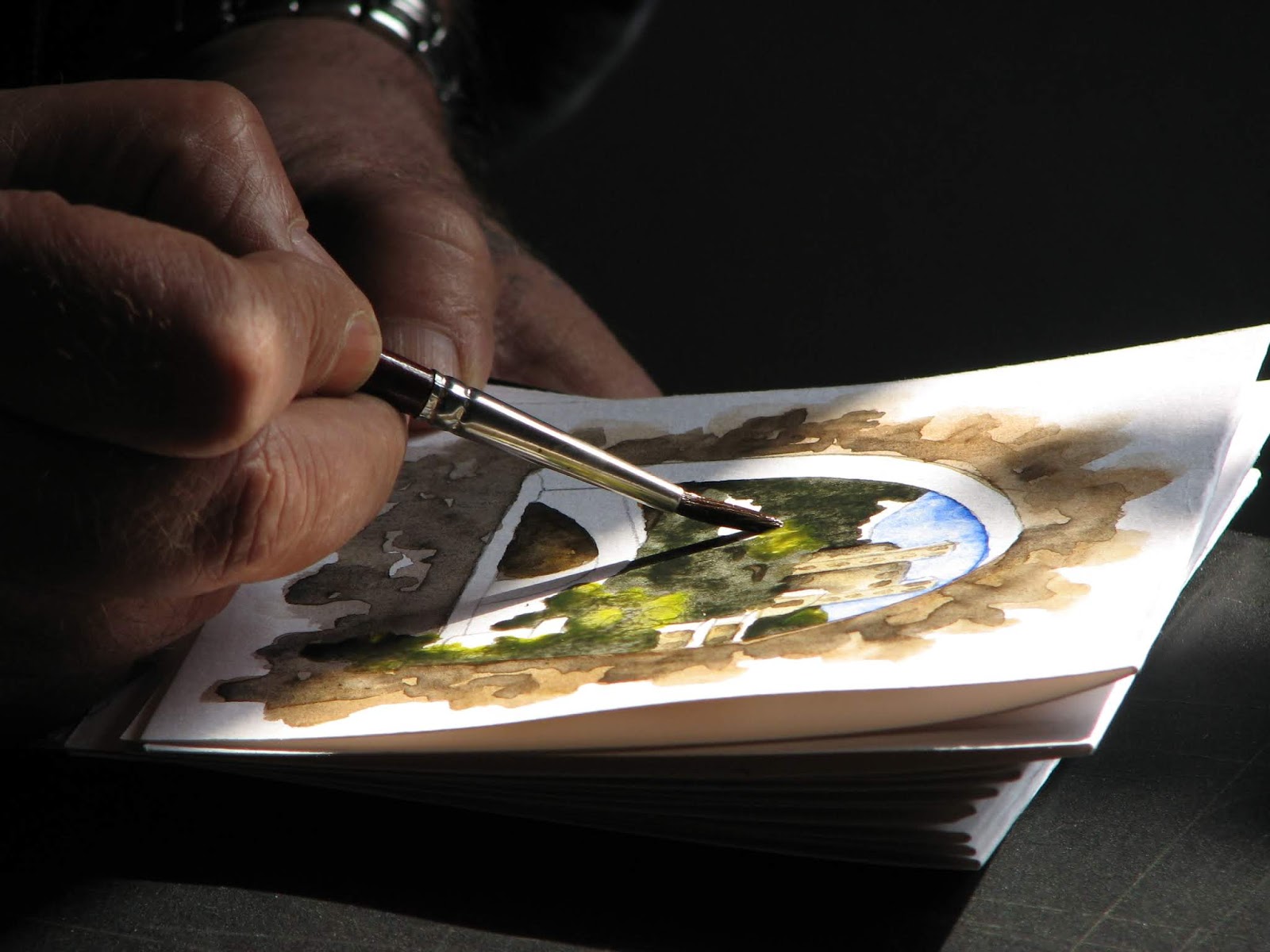
I've learned through many years of my own watercolor mistakes and others that when you think your watercolor is broken... that that's not necessarily true! I taught art at the secondary level for 15 years so through fifteen years of helping students with their "broken paintings", and of course my own, I've learned to fix a lot that has been thought to be "waste basket material." You know what's really neat is that that particular painting sometimes becomes even better because of the creative fix.
 I've always heard that watercolor painting is one of the most difficult types of mediums to paint in because it is unforgiving. I've found out though that with a good watercolor paper you can rub and scrub and scrape a lot of those mistakes away. Sometimes you can even run the paper under the water faucet to wash away all your paint, except for of course, the staining colors. I do believe though, that in order to paint a successful, non- frustrating watercolor painting, you must learn about the paint and also you must learn the basic watercolor techniques first. So take a class, watch a video, or read a book, whatever works best for you, to learn some of the basic watercolor techniques such as: graded washes, wet into wet, glazing, lifting and so on. You must most certainly learn to paint in stages, in other words, patience. Here's an example: You're gung ho and ready to paint a beautiful landscape so you paint the graded wash for the sky first. You must stop and let the sky completely dry before you paint the hard edged sawtooth mountains jutting up into the sky because if you don't wait, you'll end up with the fuzzytoothed mountains blurbing up into the sky. You will be more successful by beginning your painting with your watercolors in light values first and then build the darker values into the painting as you go. You can always get darker later, that's for sure. Sometimes you can't get lighter with watercolors unless you add an opaque white, which in my book is still o.k. to do, but you then are not a pure transparent watercolorist, if that is what you were striving to be.
So my point is, there are ways to fix a broken watercolor so don't give up. Learn the basics first to avoid many beginner problems but then remember.... With a tough watercolor paper, you can wash, scrape, erase, rub and scrub lots of those mistakes away. Don't give up and don't believe that watercolor is too difficult, because if I can do it, anyone can! That's that!
Paint like no one is watching!
www.plumedarcher.com
Article Source: https://EzineArticles.com/expert/Suz_Hume/54012
Article Source: http://EzineArticles.com/310904
So my point is, there are ways to fix a broken watercolor so don't give up. Learn the basics first to avoid many beginner problems but then remember.... With a tough watercolor paper, you can wash, scrape, erase, rub and scrub lots of those mistakes away. Don't give up and don't believe that watercolor is too difficult, because if I can do it, anyone can! That's that!
Paint like no one is watching!
www.plumedarcher.com
Article Source: https://EzineArticles.com/expert/Suz_Hume/54012
Article Source: http://EzineArticles.com/310904
Monday, July 15, 2019
Tuesday, July 2, 2019
Things You Should Know About Pop Art Paintings History
Pop art was an artistic movement that represented a strong shift from the influence of the abstract expressionism. Pop art paintings brought an original form of making art by introducing techniques of commercial art and everyday life illustrations.
 This movement first occurred in Great Britain in the late 1950s and it was meant to be a redefinition of the metaphysical gravity of the abstract expressionism. Pop art paintings were mainly characterized by the insertion of everyday life images of soup cans, comic strips, Coke bottles or even stuffed animals into the artistic expression. The expressed aim of the pop art paintings was to provide a meeting point for artists and public. Inserting commercial art symbols in their work, the artists intended to blur the boundaries between art and common people in order to make art ideas accessible for everyone.
The birth of this art movement during the 1950s-1960s wasn't a coincidence. Artists were getting tired of the inwardness and opacity of the abstract expressionism; the American society (and the British one, but on a less extent) was enjoying deep changes in terms of economic revival after the constraints of the Second World War. Therefore, the artist community mocked the shallowness and the materialism of the Americans, employing symbols of mass culture (Coke cans, magazines or comic strips) in their pop art paintings.
The artists who had embraced this art style used different symbols: American flags (Jasper Johns), comic strips (Roy Lichtenstein) and soup cans (Andy Warhol) or stuffed animals (Robert Rauschenberg).
Pop art paintings also represented icons of the artists' reaction against the dullness and complexity of the abstract expressionism. Abstract techniques were replaced with more accessible ones like humor or surface appearance. The central idea of this art movement was to express messages to the mass by transforming the ordinary things into art objects.
Although the pop art stream was very popular among the layman public, it was highly controversial among the art critics community. Some considered pop art paintings as cheap, tacky imitations of everyday life symbols; others regarded them as icons of the shallow American society at mid-century.
Nevertheless, this art movement represented a breath of vivid, fresh air in an art characterized until then by opacity and seriousness.
[http://www.urbanfinearts.co.uk] - Pop art painting gallery, framed art and UK online art gallery.
Article Source: https://EzineArticles.com/expert/Ispas_Marin/8945
Article Source: http://EzineArticles.com/80380
Monday, July 1, 2019
Sunday, June 30, 2019
Vincent Van Gogh, the Tragic Story of a Brilliant Painter
Twelve years after his tragic suicide, Vincent's work was discovered by a Parisian art dealer. Until then, no one, except for those who knew him personally, had ever even heard the name. Today, large sums of money are exchanged for his work.
Article Source: http://ticles.com/64989
Vincent was born in the Dutch village of Zundert, in the south of the Netherlands. He studied theology and became a preacher in the Methodist Church. He also worked for several different art dealers in The Hague, London and Paris. Only in 1880 does he start painting, first traditional and very "Dutch", reflecting the Dutch rainy climate with many dark brown colors.
In 1886 Vincent moves to Paris, and two years later to Arles, on the Mediterranean, near Marseille. On the 20th of October of that year, Vincent's friend Gauguin joins him in Arles. Vincent's art becomes lighter in color, showing the Mediterranean sunlight in it.
Two months after Gauguin comes to Arles, Vincent has a schizophrenic episode and cuts a piece of his own ear off. The years following, Vincent starts to get very sick, and he eventually kills himself in 1890. His brother, Theo van Gogh, who had supported Vincent all of his life, dies seven months after Vincent, possibly from grief.
Van Gogh never sold a painting in his life. Today, his paintings are the most expensively sold in the world, and are admired around the globe in many museums and private collections. He also is celebrated as the forerunner of the expressionist movement.
Written by Duco Sminia
Featured artist: Vincent van Gogh [http://vincentvangogh.dusmart.com].
Research done by Irene Sminia.
Article Source: https://EzineArticles.com/expert/Duco_Sminia/13916
Article Source: http://ticles.com/64989

Vincent was born in the Dutch village of Zundert, in the south of the Netherlands. He studied theology and became a preacher in the Methodist Church. He also worked for several different art dealers in The Hague, London and Paris. Only in 1880 does he start painting, first traditional and very "Dutch", reflecting the Dutch rainy climate with many dark brown colors.
In 1886 Vincent moves to Paris, and two years later to Arles, on the Mediterranean, near Marseille. On the 20th of October of that year, Vincent's friend Gauguin joins him in Arles. Vincent's art becomes lighter in color, showing the Mediterranean sunlight in it.
Two months after Gauguin comes to Arles, Vincent has a schizophrenic episode and cuts a piece of his own ear off. The years following, Vincent starts to get very sick, and he eventually kills himself in 1890. His brother, Theo van Gogh, who had supported Vincent all of his life, dies seven months after Vincent, possibly from grief.
Van Gogh never sold a painting in his life. Today, his paintings are the most expensively sold in the world, and are admired around the globe in many museums and private collections. He also is celebrated as the forerunner of the expressionist movement.
Written by Duco Sminia
Featured artist: Vincent van Gogh [http://vincentvangogh.dusmart.com].
Research done by Irene Sminia.
Article Source: https://EzineArticles.com/expert/Duco_Sminia/13916
Subscribe to:
Posts (Atom)